We read more articles on our phones than on desktop, so are media organisations doing enough to engage their readers on-the-go?
Buzzfeed and Quartz have created their own unique voices on mobile apps to gain as many readers as possible, and it’s even influencing their website content too.
When Buzzfeed launched its mobile app 3.5 years ago, it found that three-quarters of its readers were aged between 18 and 34. They were young, busy and on their phones, and Buzzfeed needed to capture their attention.
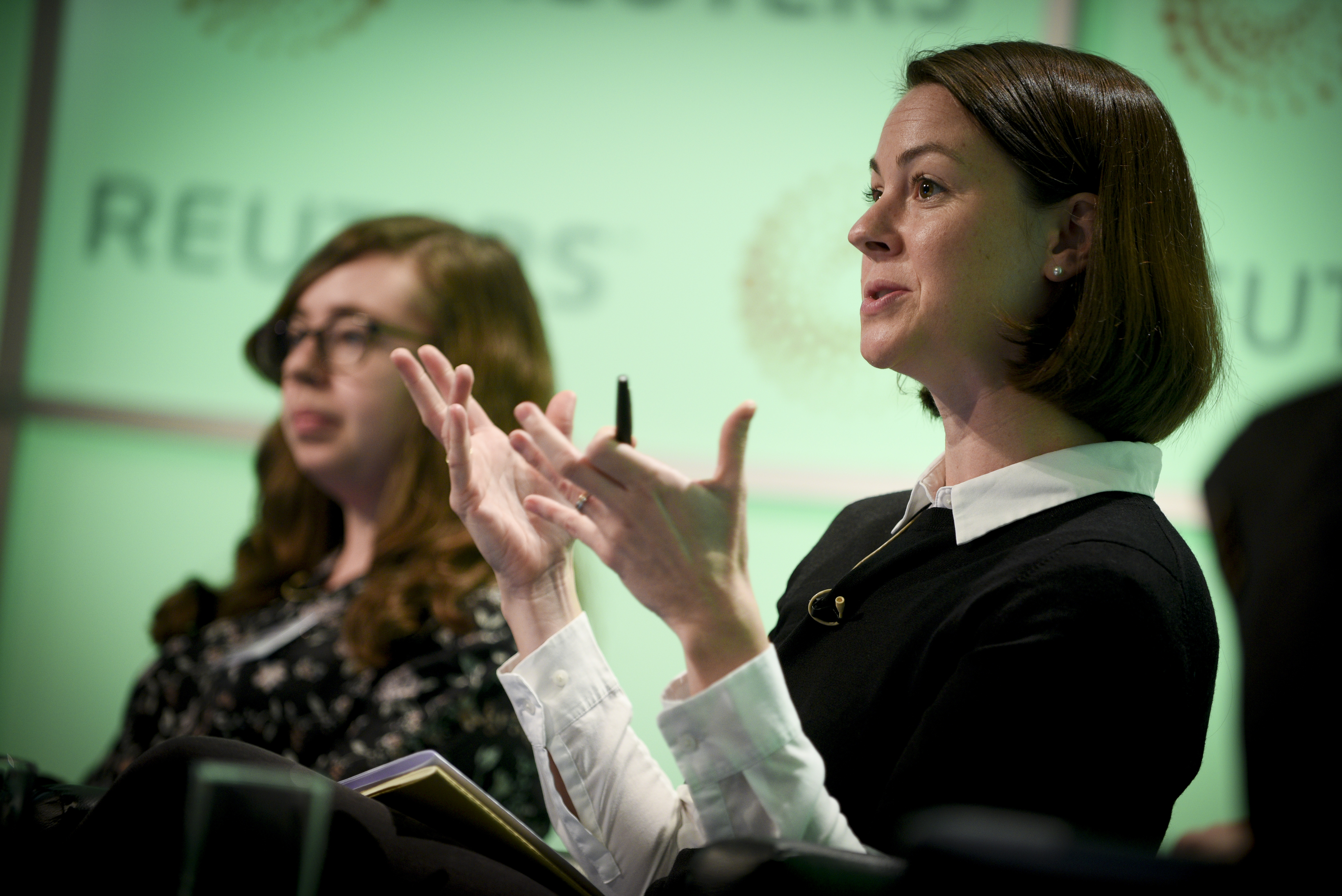
Buzzfeed’s response was to craft a persona that’s like your “fun and interesting friend that has something extra to bring to the table”, according to Brianne O’Brien, lead news curation editor at BuzzFeed, speaking at newsrewired in London today (22 November).
The app uses visual tools like gifs, timelines and emojis so readers can catch up with the news in seconds, but uses no automation – it is curated by editors encompassing a conversational, often humorous tone, which makes readers feel like their talking to someone they know.
'When testing out mobile news features, use the crappiest phone a colleague has, rather than the iPhone X, then you'll know if your story will load everywhere' – @colleenmcenaney #newsrw
— Rachel Banning-Lover (@RBanningLover) November 22, 2017
A distinct tone is important for Quartz too, explained Jason Karaian, global finance and economics editor at Quartz.
A story on mobile “needs to have a different sort of momentum to it” to keep a reader interested as they scroll, he explained, noting that his team works off the understanding that they need to have a “very intimate kind of relationship” with mobile audiences.
Quartz’s app works like a chatbot, Karaian explained, sending readers updates from other publications as well as their own website while using gifs and emojis to essentially represents the “distilled voice of Quartz”.
Quartz’s push notifications often come in the form of haikus, and its Trump “snooze function”, introduced after the 2016 US presidential election to give readers the option of muting all mentions of Trump for 24 hours, was a good marketing tool for the app as well as a significant editorial decision.
New feature in the Quartz app for iPhone: If Trump news is wearing you down, take a 24-hour break. https://t.co/nt66aOFiUg pic.twitter.com/wxSPgFZPWj
— Zach Seward (@zseward) May 23, 2017
Since its launch in 2012, Quartz has been using mobile to create its own personality distinct from other websites. Its email newsletter, which preempted the resurgence of email for media organisations, has always been aimed towards mobile, and its newer email publication, “Obsessions”, lets readers dive into one topic – from cider to concrete – through facts, gifs and videos on their lunchbreak.
The response, Karaian said, has been “very good” – noting that often different parts of the email that include these quotes and graphs, might not work well as a story on their own, but they work in an email format, and on mobile. “We stumbled into a new way of telling those stories – another way for us to geek out.”
The panel discussion highlighted the importance of publications needing to keep simplicity in mind when it comes to mobile content.
Complicated interactive data projects are harder to use on mobile and can face issues with loading times.
In response, data journalists are moving away from interactive projects to graphs that are more explanatory. Asking your reader to simply scroll or look at a line chart is often more effective than asking them to work with search bars and drop down menus, according to Colleen McEnaney, graphics editor at The Wall Street Journal.
This means that data journalism can be done by newsrooms with fewer resources, said Karaian. Crude and simple images work “amazingly well on mobile”.
“It’s more of a mindset thing than a resource thing,” he said.

