Since the Washington Post’s emerging news products team launched a year and a half ago, it has engineered apps for Amazon’s tablet, desktop, mobile phones and the Apple Watch, but always with an eye on the paper’s most traditional product.
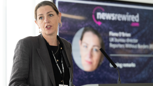
Christopher Meighan, director for digital news design and presentation, emerging news products at the Post, told the news:rewired conference in London today it was important to create apps that reflected the values of the print product —bold visuals, awesome content and expert curation.
Here’s a guide to some of the ways his team has looked to maintain the same values in The Post’s digital app suite:
Bold visuals
One of the hallmarks of the Post’s digital news suite is its custom-designed “brights”, or graphics that sit atop stories. Between 35 and 50 unique icons are produced each day by a team of around-the-clock designers.
Meighan said:
We create a new icon every day and it reflects the news of the day. They’re different than what’s trending in digital now, where everything is templatised and not a lot of creativity goes into the display.
The brights’ design is up-to-the-minute as new information and visuals emerge in breaking news stories. Following the Paris attacks, Meighan said his team went through eighteen different models as the story developed. The brights are featured both in the tablet and phone apps.
Visuals and images also feature heavily in The Post’s daily visual newsletter First Reads, which arrives in subscribers’ inboxes every morning with conversational titles that take a step back from SEO optimisation. The visual newsletter doesn’t require a lot of work to read, letting images tell the story.
Awesome content
One of the biggest challenges of designing apps for small-screen products like the Apple Watch is shrinking the content to fit the small screen size. At The Post, this means taking a full-size story and condensing it “basically down into a bullet point.”
Meighan said using infographics and charts to summarise text allows readers to access the information in a story without trying to read the full piece. Pulling out the most important stats and figures helps The Post tell the same hard-hitting story in a more digestible way across platforms. Lists also allow the same story to be told with either a turn of the Apple Watch dial or the swipe of a screen.
Focused bullet points
When designing news apps for The Post, Meighan said the goal was to get away from models that “overwhelm the reader with hundreds of stories.”
On the Post’s tablet product, “pinch view” shows readers just two stories at a time, which “encourages further engagement with our content.” Using a split-screen model, readers can then swipe to explore additional content, reflecting the reading pace of a traditional print newspaper rather than the bombardment of social media feeds. Updating just twice a day (at 5am and 5pm) it also mirrors the print schedule of traditional newspaper editions.
Pinch view has a mobile equivalent called “peek view”, which shows a sliver of the next news story at the bottom of the screen.
Meighan said:
We wanted to make sure both of these apps spoke to each other. Obviously the side-by-side thing was ridiculous, and believe me we tried it. But you had these two little tiny stories and you could not see either of them, so we flipped it on its side to have the second story sort of peek.
“Rainbow-view”, which is based on the idea of a magazine centrefold, also takes print design as a model to hook readers into two related stories that share the same image on a split screen.


