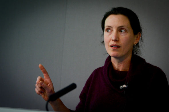
Visuals to accompany a great piece of writing or reportage are like icing on top of a cake, the session on visual storytelling at the news:rewired conference, today in London, was told.
“If journalists are driven by pictures and consider them from the beginning, they have the key to success”, said BuzzFeed editorial director Tom Philips during this afternoon’s session.
He was joined on the session panel by freelance ‘infografista‘ Lulu Pinney and creative technologist Christian Payne in a discussion covering infographic tips, the incorporation of video apps, and achieving the perfect balance between imagery and text in an article.
Pictures are powerful enough to tell stories on their own and one of the key things to remember when incorporating these into a piece of writing is the risk of unwanted competition between them and the story itself, the panel said.
Here are some of the panel’s top tips on using visual material to help stories stand out:
Think substance before style
Infographics are brimming with creativity, but it can sometimes be easy to get carried away with colour. Keep in mind the message you are trying to get across and remember they are not something you should just “add content to just to jazz it up”, Pinney warned.
Use pictures as a way to structure your story
People enjoy looking at pictures and these are a good way to break up an otherwise chunky block of text. However, be mindful not to overdo it and think of the way an image can “make people either share a story or advance it in a certain way”, Philips said, adding that whilst doing so, you should be “taking the audience on a journey”.
Images are easy on the eye, but context matters
Speaking about people’s tendency to lean towards visualisation as a form of perceiving information, Payne noted that:
50% of your brain is active in visual processing, 40% of people respond better to visuals, 70% of your sensory receptors are in your eyes and the brain processes visuals 60,000 times faster than text.
He added that you should not rely on the picture to solely depict the feelings of the person portrayed, but instead think about what should accompany them in order to create “deep and meaningful stories”.
Experiment with tools
In order to provide a more in-depth and varied visual coverage to your audience, don’t just stick to one tool. Some of the tools, suggests Pinney, that journalists might like to experiment with include visualisation software Tableau, ABZV Datawrapper and Infogr.am – to name just a few.
Journalists were told not to be fearful of these new technologies, but to approach them with confidence, as “there is no exact formula you can write to create infographics”, Pinny added.
On the same topic, Phillips added:
Be playful with visual storytelling, try things out. It’s unlikely that you will kill the story by trying out visual approaches.
Take advantage of visuals’ “superpowers”
Each type of visual is likely to have a stronger impact in a particular case, depending on the message intended for the audience. While Phillips said that “vines have changed the game as a shareable form of short-looping video”, he also added that static images or screen grabs can still sometimes beat the competition, arguing that they are a great way of showcasing something unique to the audience.
Pinney added:
Tap into the things visuals can do better than words, such as: they’re better at making comparisons, showing physical detail and representing more abstract concepts.

